Midagon brand identity & website renewal

Holistic brand that landed

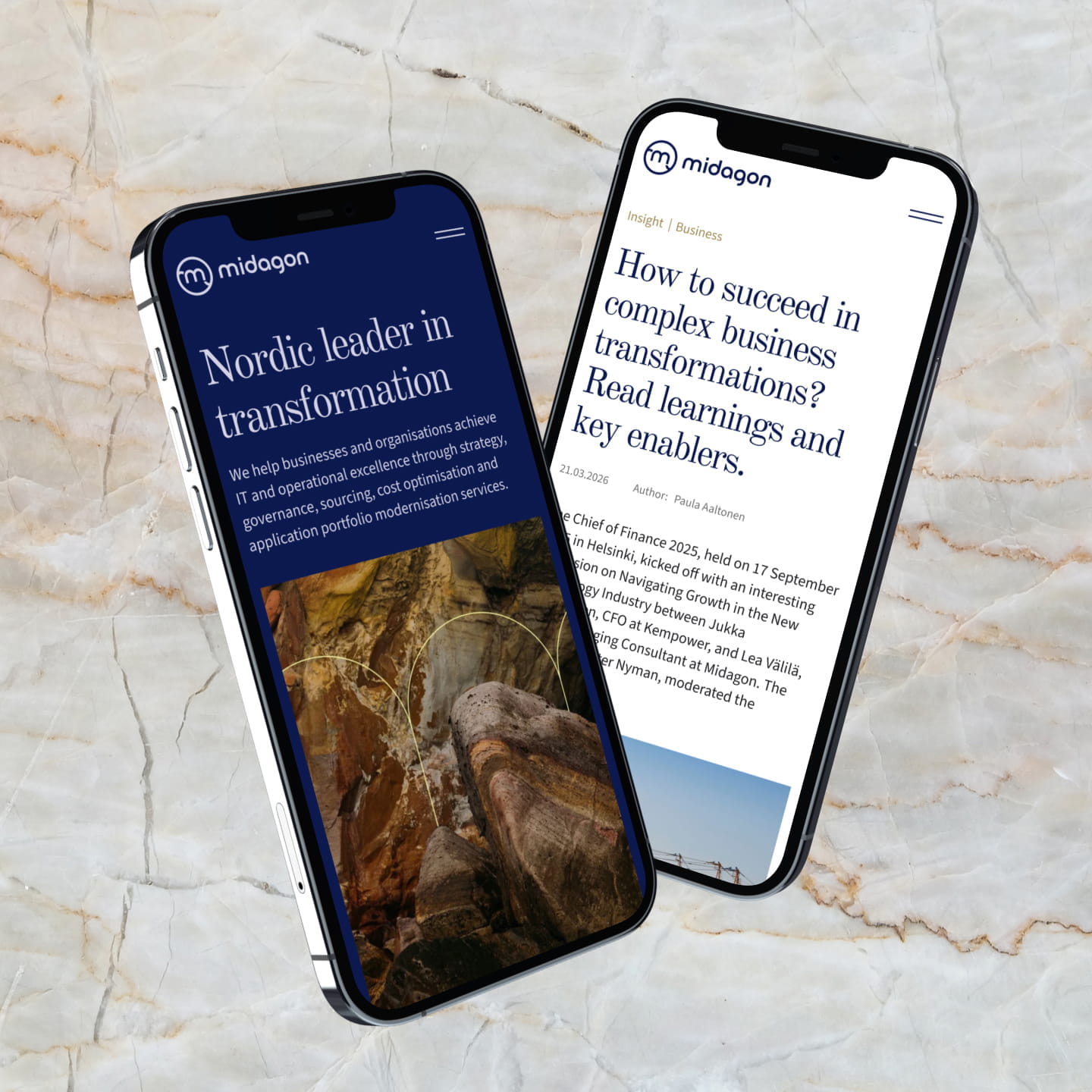
Miltton, in close collaboration with Midagon, ran a full brand refresh and website rebuild — developing a visual identity, brand promise, and digital presence that gave an independent Nordic transformation consultancy the clarity and coherence its expertise deserved. Sometimes it takes a marathon; this time it meant laying the ground for higher aims. Taking a bold leap in the right direction resulted in a polished brand at the finish line: a brand that sticks, scales, and lands.

Digital services & web development Positioning and brand development

Client: Midagon

Share

Brand strategy & positioning

A quality leap, not a patch

Midagon was not a blank page. Founded twenty years ago, the company had built something real: a reputation for independence, a culture of senior expertise, and a genuine record of guiding organisations through their most business-critical transformations.

But Midagon was ready for more. Growth was the ambition and with it, the need for a brand that could carry a clearer, more cohesive story across Nordic markets. Not a patch, but a quality leap: a brand built for the complex, large-scale change Midagon helps its clients navigate every day.

Going back to brand roots

The work started not by inventing something new, but by going back to what had always been true. Through iteration rounds, stakeholder insight, and careful analysis of Midagon’s business environment and competitive landscape, Miltton helped reignite the fire that was already there. The positioning, tone of voice, and brand promise emerged from that process. The result was a brand strategy with earned confidence and the clarity to carry Midagon into the next chapter of growth.

Sharpen the edges, raise the ambition

Independence and seasoned experience are Midagon’s sharpest edges. Miltton worked to make those edges visible: ensuring the expertise is seen as clearly as it is felt and the culture stays strong even as the company evolves.

Together we shaped a narrative with that forward-facing confidence — the kind that makes someone stop and think: I should, shouldn’t I? Because in the end, a story that moves people ignites the will to leap and aim high while doing it.
Brand promise

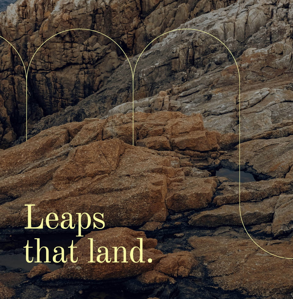
For Midagon, a promise is something you earn by doing. Leaps that land is the distillation of Midagon’s experience in guiding organisations through their most consequential transformations. Midagon nudges people forward, but more importantly, makes them want to leap. That is the experience the clients get and that is what the brand now says out loud.

Insight highlights

  1. A brand promise rooted in outcomes, “Leaps that land.”, gives Midagon a message that lands differently with each audience: ambition for Midagonians, confidence for clients, meaningful freedom for talent.

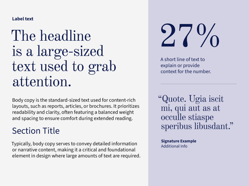
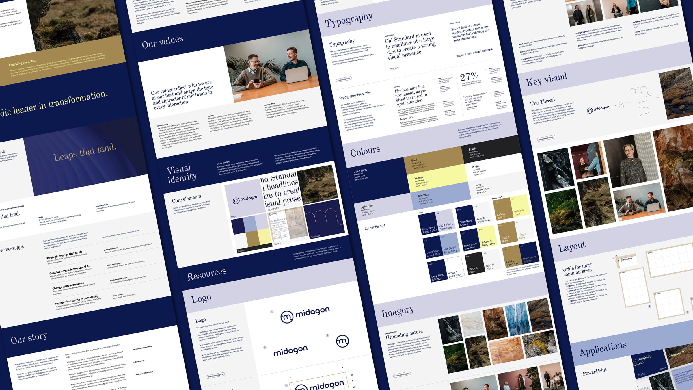
  2. Old Standard paired with Source Sans creates deliberate editorial tension — trust balanced with approachability — a typographic expression of who Midagon is: seasoned, but never stiff.

  3. The Thread — a yellow line drawn directly from within the brand system — became the key visual metaphor: a guide through complexity, offering direction without prescribing the path.

Visual identity

Inspiration that was already there

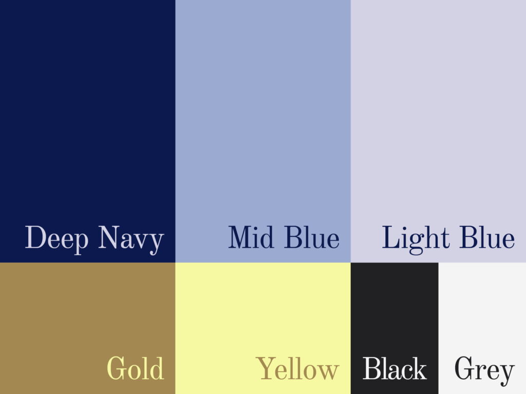
The visual identity followed the same principle of looking inward before looking outward. The starting point was the Midagon name itself: the arches already living inside the letter M. That shape became the foundation: a form suggesting momentum, structure, and the kind of steady forward movement that defines Midagon’s work with clients. From there, a full visual system took shape — a palette rooted in Deep Navy and Gold, a typographic pairing of editorial weight and everyday clarity, and The Thread, a yellow line drawn directly from the brand’s own geometry. Nothing was added for effect. Everything earned its place.

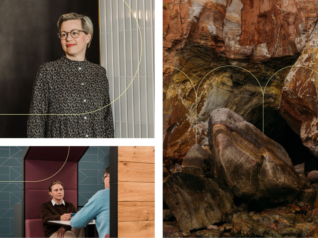
The Thread. A yellow line that lives inside the brand system itself — not layered on top, but part of the foundation. It flows across applications, connecting and guiding. Its unconventional warmth cuts through the category without sacrificing the trust Midagon has built over the years.

Website renewal

The brand’s digital crown jewel

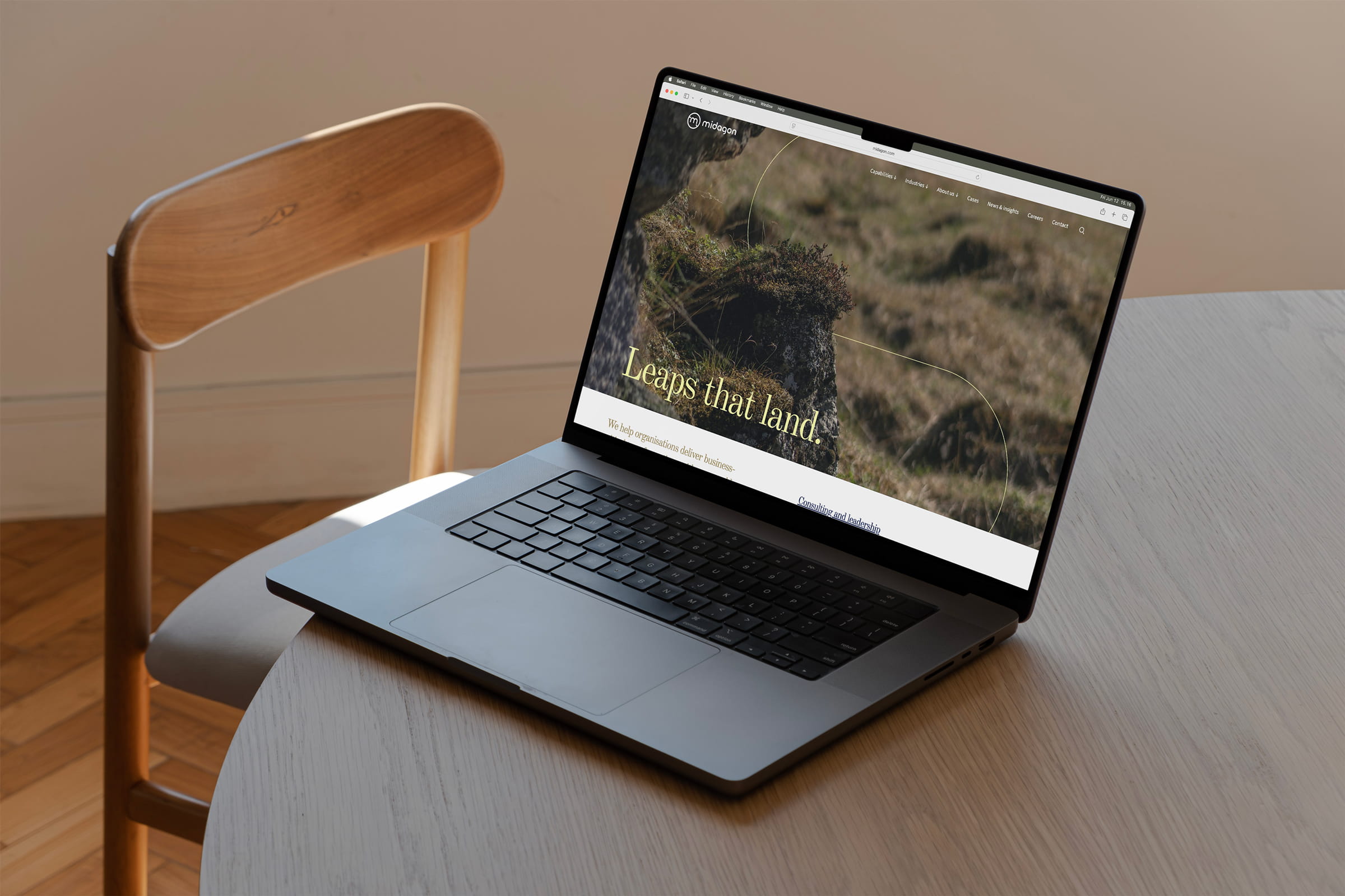
With the brand strategy, visual identity, and assets carefully documented and in place, the work turned to its digital culmination. The previous Midagon website did not sufficiently support the company’s Nordic growth ambitions, nor did it guide international visitors naturally toward contact. Strong brand know-how formed the backbone of the renewal: every structural and content decision was made in service of the brand, not alongside it.

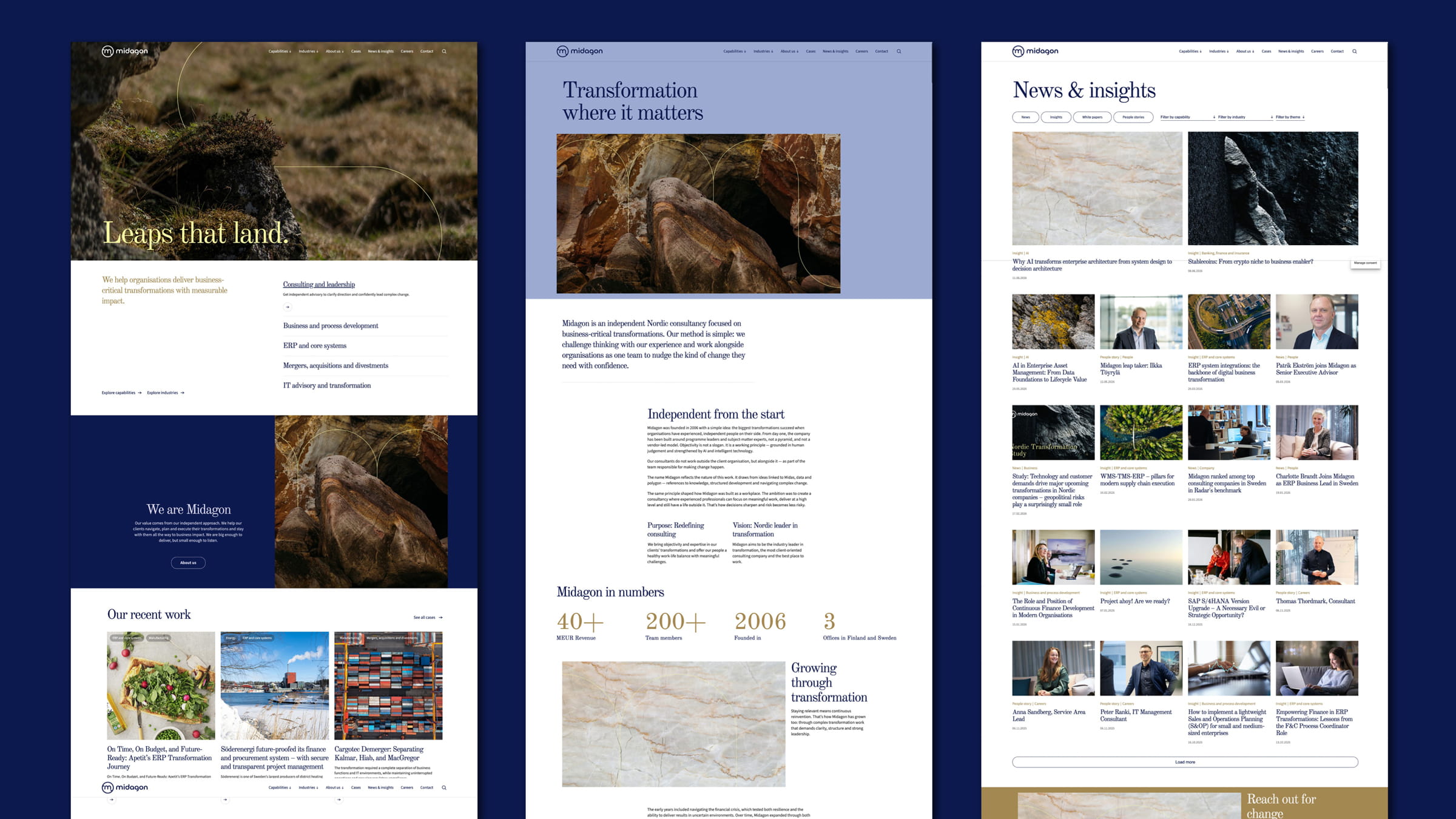
The renewed site was built around a clear information hierarchy, user-centred content, and a visual identity that speaks with the same confidence as the brand system behind it. Technically, the site is a modular WordPress build using the Gutenberg editor and custom components — designed to be easy to maintain and to grow with Midagon over time. Both structure and technology were planned with future needs in mind, including the evolving role of AI in how content is found, read, and used. The result is a website that functions as a credible, scalable digital home — the primary brand channel and an effective lead generation tool for an international audience.

We are first and foremost a Nordic consultancy. The new brand gives us the confidence to take the leaps and run the miles with our clients — and to guide their most important transformations with a brand that truly reflects our philosophy. In a field where many sound alike, our independence, our senior experience, and our Nordic identity are what set us apart. Now that finally shows.

Client feedback

Miltton’s impact

  • Brand strategy & positioning
  • Tone of voice
  • Visual identity
  • Graphic design
  • Copywriting
  • UI/UX design
  • Web development
  • Brand documentation
  • Project management

Want to hear more?

Contact us, we’ll be happy to help!

Check out our other work